It’s no secret that professional planners work on a variety of planning related topics and documents. From Comprehensive Plans to Comprehensive Outdoor Recreation Plans and more, there are many things that go into planning a community and its future development. It’s a thoughtful balance of vision, strategy and science — which is where we find the useful tool called GIS.
One such topic that is growing in both need and popularity is housing studies. As former MSA Senior Planning Team Leader Jason Valerius mentions in this feature about Housing Studies at MSA, there is a rising demand for communities to pinpoint needs within their borders and make public places more attractive for both businesses and residents. But I’m here to talk about GIS, and how it is vital to developing planning reports, particularly housing studies.

GIS brings data into focus
Mapping can shape a viewer’s understanding of an otherwise wordy report. Visuals are key to understanding, especially when discussing large geographic areas or complicated topics like “target infill areas” or “development constraints.” It’s easy to sit back and talk about areas by street name or census block, but unless you are extremely familiar with an area, it can be hard to visualize how big an area is, or how or why certain categorizations are made.
Some housing studies are conducted on a small community level, while others cover an entire county. Visualizations can make a huge impact on project understanding when project scales change. Not only do visualizations help the viewer, but they also help the report writers understand their data and can facilitate discussion about data types, missing data, and how to categorize data to best represent everything in an accurate way. Maps are also wonderful for public input. We have found that people respond better to, “Where on this map do you think we need an improvement?” compared to, “Please explain an area that you think needs improvement.”
Quality in, quality out
When utilizing GIS to create maps and figures, the most important factor is clean and accurate data. It is hard for professionals to create accurate reports and data representations if the data is outdated or badly maintained. Generally, much of the data used in generic maps is maintained by large public data sources on the state or even federal level, such as the State of Wisconsin, FEMA, USGS, or the DOT. This information is considered reliable and relatively detailed, although there are many opportunities to put geo-specific data to work toward a more particular problem or solution.

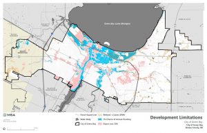
Custom maps like the above GIS-generated graphic showing development limitations within Green Bay, Wisconsin, help a viewer understand parameters for target development. For example, someone may ask, “Why aren’t there more housing development or industrial opportunities in certain areas?” Looking at this map, we can estimate that large-scale development within flood plains or in areas with steep topography may be too cost intensive or prone to flooding.
Other sources of data are parcel or assessor driven. Sometimes, the most detailed and insightful analysis takes place on a parcel level, which can more specifically identify property details. This data is frequently maintained on a local or county level and at the mercy of adequate staff time and resources to keep up with. If the data is old or messy, a larger lift is required from GIS personnel to get it organized for use, and more communication between the client and report preparers is required to validate the data. This costs extra time and money and can turn a study into something unnecessarily complicated and expensive.
Data ownership
In recent years, we have seen communities “farm out” their data to larger companies to maintain it for easy access and clean storage. While this can be a decent option for smaller municipalities, some of these companies have monopolies on the software they use, which requires an additional cost to extract into a usable GIS or large report template. This fee falls onto the community’s shoulders — an oftentimes surprising expense for what should be fair and equitable access to their own information.
Data availability can be hugely limiting to not only maps and figures, but a planner’s ability to make specific recommendations to a community. It is hard to establish if a community is lacking apartment complexes or senior housing, for instance, if a community doesn’t have accurate data about how many housing units they actually have.
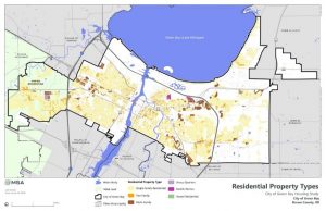
Here is an example of residential properties on a parcel basis by type (single family, duplex, multi-family, etc.) for Green Bay, Wisconsin:

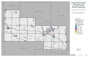
Likewise, here is a map of properties by improvement ratio (an expression of property value) in a region where parcel data could not be obtained for the whole study area:

As you can see, there is considerably less data available, and much of the map is empty space without any information whatsoever.
The end goal is simple: the more data that is available to community planners, the more accurate, attainable and sustainable the plans for future development will be. Municipalities that already own and maintain a GIS database have the ability to retain and build upon that foundation, which is instrumental to all kinds of community planning and budgeting work. Communities that do not have the ability to create a custom GIS database have options at their disposal: identify in-house staff to help maintain the information and keep it duly updated — or outsource to a third-party organization. There certainly are quality companies available to assist, and different options available depending upon where a community is located. Whatever the selection, a bit of research into the fine print of data ownership and access should be conducted before signing any contracts.
The GIS difference
While “pretty graphics” are certainly not necessary to a good housing study or comp plan, they certainly help community leaders and the general public better understand information. And, as illustrated, these graphics serve a much more critical function than just eye candy. There is beauty in the quality of data they contain and in how much they can help communities make important decisions about where, when and how to invest in housing infrastructure. There is also power — and freedom — in owning your own data. This has become a frustration for communities and planners alike, who both simply want access to the information needed to make the best decisions and plans possible. GIS is the differentiator. While not a must-have for communities embarking upon an assessment of their housing infrastructure, GIS puts all that pretty data to work for you in a real, meaningful, and implementable way.
To learn more about MSA housing studies, planning or GIS services, don’t be shy! Reach out today and let our great resources lead you to planning success.
