Potholes, crumbling asphalt and pavement cracks so deep they’ll shake the fillings right out of your teeth. Sound familiar?
Communities across the country are challenged with maintaining, resurfacing, or replacing roadways for safe, sustainable use. It’s an expensive, recurring budget line item. Community leaders need to objectively prove they are investing the funds at the right time, in the right places.
Geographic Information System (GIS) software and technologies are smarter than ever, with ingenious ways to customize the way communities manage their assets. In this case, roadways. MSA GIS professionals are pairing industry changing software programs like the Cartegraph Pavement Asset Management System with Esri ArcGIS Online platforms to develop tailor-made visual reporting tools — called dashboards — to help communities gain data-driven control over roadway conditions and the overall pavement lifecycle.

Pavement Rating Dashboard
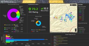
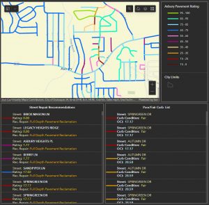
MSA’s Pavement Rating Dashboard is a colorful graphic display of information designed to distill complex information down into something more digestible. At first glance, the viewer sees a collection of data organized in easy-to-understand widgets: a community map with color-coded pavement ratings, total miles of street assessed, overall community road condition rating, a pie chart of various surface materials found, amount of total mileage per pavement rating, chart of recommended repair options, and lists of individual streets or roadways with accompanying rating scores.
Ratings are based on the Cartegraph Overall Condition Index (OCI) Ratings System. It functions similarly to the PASER scale (Pavement Surface Evaluation and Rating) developed by the University of Wisconsin-Madison but has a lot more “meat” on its bones. The OCI system provides the user with a seemingly non-negotiable means to assess roadway conditions and the Pavement Rating Dashboard offers the means to review data in a tangible, easy-to-decipher manner. This combination is impactful for a variety of reasons:
- Accuracy
Staff members in the field are able to make a 1:1 comparison between what they are seeing and the photographic examples for each rating index supplied by the OCI system. There are 10 Compiled OCI Index categories to choose from and reviewers can assign pavement ratings to the one-hundredths level of a percentage, resulting in meticulous statistics from which to plan and prioritize.

- Prioritization
Public works directors and community leaders can make objective, data-driven decisions about which roadways should be addressed first, and why. This removes the subjectivity of ratings between staff members with varying levels of experience and eliminates any personal bias or political influence over which streets should be repaired or replaced before others — saving communities time, resources, and frustration over differing opinions.
- Budgeting
A Pavement Rating Dashboard plainly illustrates which streets need the most immediate work and what the recommended type of repair should be — whether spot crack fill, seal coat, panel replacement, bituminous patching, mill and overlay or full-depth pavement reclamation and replacement. This can be instrumental in planning and budgeting for short- and long-term fixes, with the ability to earmark the right amount of funding to get the job done.
- Goal setting
Having a clear understanding of roadway deficits and needs within a community allows leaders to set future goals and make plans to reach them. For example, say that a city has its entire roadway network assessed using these tools and realizes that the total Citywide Road Condition received an OCI index rating of 62 out of 100. This might trigger goal-setting discussions to strive to get the overall road condition index across the community to 75 or 80, let’s say, by the year 2035. With a clear objective in mind, the community can outline definitive steps to reach that goal, knowing which specific streets need attention in order to raise the bar. Annual re-inspections can then help track progress and ensure quantifiable steps are being taken to reach the community’s goals.
- Forecasting
Communities can also begin assigning real numbers to the goals created, tying together big-picture items such as capital improvement plans and the dynamic influences of the economic market, materials, and labor over time. A useful tool for this is the Cartegraph capital planning software program called Scenario Builder. It affords users the ability to input current market-rate costs for infrastructure improvement projects (such as roadway repairs/replacements) and adjust them to match annual inflation or changes in industry costs. It also aids in assessing community infrastructure on a holistic scale, considering the water, sanitary and other utility networks that all must be evaluated, maintained and replaced as a cohesive, cross-functioning system. Scenario Builder can also be used to answer those “what-if” questions such as: “What if we are anticipating a budget decrease in three years?” or “How would our project timeline or long-range goals be impacted if we increased our maintenance budget by 20%?”
The Tools of Tomorrow
The way we inspect, maintain and improve our community assets is changing for the better. GIS apps, mobile tools, and dashboards can provide real-time, accurate information — taking the guesswork out of planning for infrastructure upgrades. These tools help leaders maximize their limited funds and make better, more informed decisions about where, when, and why to invest in community improvement projects.
Curious to learn more? Request a Free GIS Demo and let MSA make the most of your data.

